
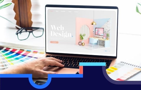


When it comes to building or redesigning a w
ebsite there’s a bunch of different elements to consider.
You’ll need to incorporate attractive visual flair that pulls users in, urge them to action with click-worthy content, whilst keeping the brand identity and tone consistent throughout.
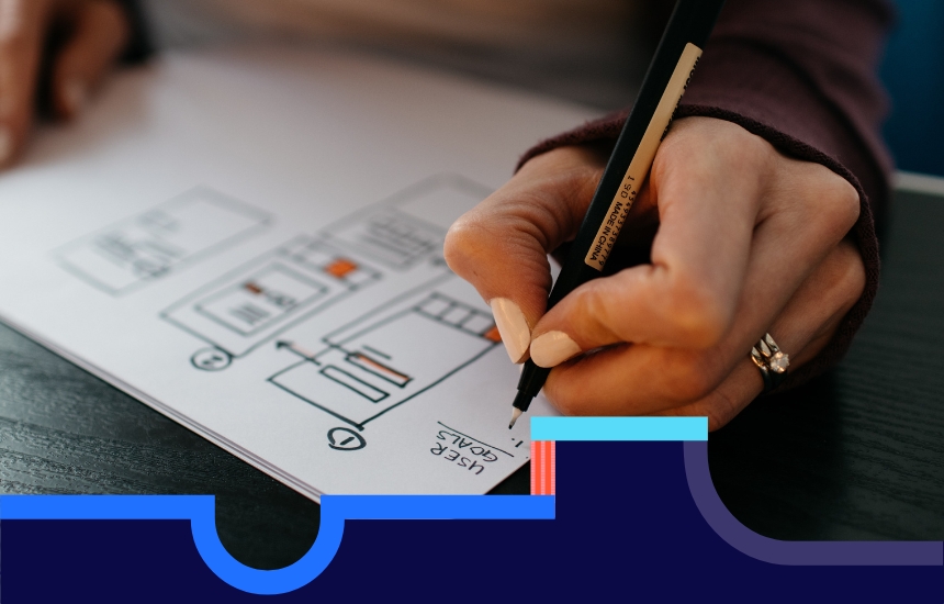
Another important element to designing your dream site is its usability.
How the flow of information benefits the user and how the experience of interacting with it feels to the user, also known as UX design.
Your user needs to feel good when they interact with your website.
Keep in mind, most people that come to your site are there to complete an action of sorts.
Whether that’s light discovery or research about your brand or they’re intending to make a purchase; you need to make this process as hassle-free as possible. Or risk losing a potential customer.
After all, attention spans online are notably short, less than 15 seconds in fact.
Why UX Web Design It’s So Important
Great UX web design is key for driving conversion rates and for giving a positive consumer experience.
And there are two reasons why.
Firstly, your role as the UX designer is to fulfil the user’s needs. You want to provide an experience that resonates with your customers, converts browsers into buyers and furthermore, keeps them loyal to your brand.
And secondly, by thoughtfully curating customer journeys and enhancing the experience of your users, you’ll serve the needs of the business as a natural byproduct.
It’s a win-win!
How Customers Respond To UX Web Design
UX web design influences how users feel and respond to your site.
People may visit your site as the result of PPC (pay per click), search engine optimisation (SEO) or social media channels.
And when they do, your site needs to meet the customer’s expectations.
So what does that look like?
It starts with the overall structure of the site. Logic takes charge here.
You want users to feel comfortable with how your site is presented. This means avoiding confusing or chaotic placement of tabs and menus and having clear calls to action.
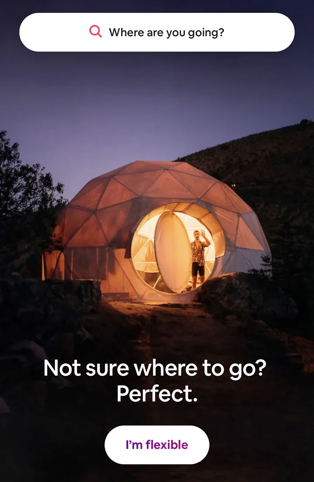
Take Airbnb as an example. The layout is minimalistic, avoids fuss and directs the user where to click.
Most sites make use of their header and footer bars to give customers an obvious area to explore the brand or to find resources and contact information.
Take a look at these examples for great UX web design.
The first time a customer views your webpage, they’ll have a predetermined path for where they look for things.
Meet them on that path.
Keep this sense of logic consistent throughout each page. People will generally explore a few if not all of your web pages so stick to the theme and make it uniform throughout.
Industry leaders like Apple and Nike spring to mind for impeccable UX web design.
How You Respond To The User
Equally important as the structure, is responsive UX web design.
Responsiveness is how well your site adapts to different layouts, depending on where it’s being viewed.
Mobile design is just as important as desktop design in today’s world with 59% of Google searches taking place from a mobile device in 2021.
A staggering number we’re sure you’ll agree.
When designing your site, keep in mind different elements like tabs, buttons and images, and how these will translate onto mobile devices.
Collapsible menus are a great example of responsiveness on smaller screens.
If users struggle to interact with it, having to pinch, zoom and rotate their devices, they’ll likely get fed up and back out.
Check out this article on UX web design features and best practices.
Every Word Counts
When we talk about typography, we’re speaking about the style and arrangement of words. The physical writing on the page.
There are hundreds of options available for different styles and fonts but no matter what you choose, it needs to follow some basic principles.
- It must be easy to read or skim (most users won’t read ALL the text).
- It needs to be legible for as many users as possible, including those with reading or visual disorders.
- And you’ll want to factor in how it looks on mobile devices too.
Typestyle and fonts speak to us simply by their appearance.
A user will have a completely different reaction to formal styling like Times New Roman than they would to an artistic style that’s cartoonish and bold.
Choose typography that best represents your brand and what your customers expect to see.
Here’s a handy guide for picking typography that best compliments your site.
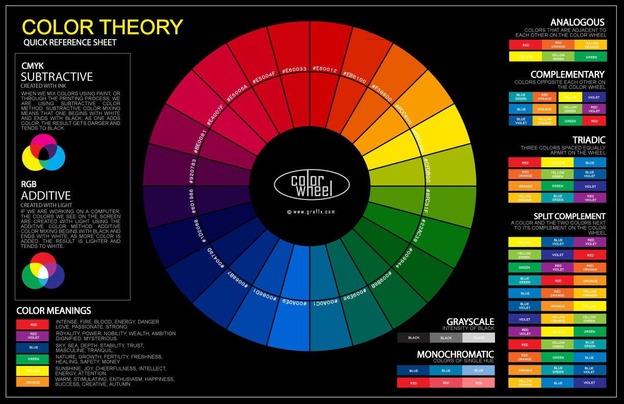
Stop Customers Seeing Red (unintentionally)
Closely related to typography are the aesthetics of your web pages.
Like word choice and style, colours provoke emotional responses from users too and affect how we interact with websites and brands.
Your colour choice should follow the same principles as typography by reinforcing brand identity while being easy on the eye.
The wrong combination of colour can make it hard to read text, distort images and ultimately, it can be off-putting for the user.
There are plenty of resources online that talk about which colours work well together and those that don’t, like shown in the chart below.
Less is More in UX Web Design
We’re referring to whitespace here. Whitespace is blank or the negative areas on a page.
It can be tempting to put as much imagery or text on a page to fill it up, you might think you’re wasting precious real estate but in truth; it has the opposite effect for UX web design.
Our brains overload when there’s too much information on a page and fatigue gets the better of us causing the average user to navigate away from a site.
Leaving space between elements on the page will help direct the user’s attention where it matters most.
This is especially true for CTA’s (calls-to-action). Where we’re asking the user to complete an action such as “buy now”, or “discover more.”
With plenty of whitespace around button prompts, our eyes are naturally drawn to it. The same can be said for any area you’re trying to highlight for the user.
Less is more when it comes to UX web design.
Thinking Like Your User is Half the Battle
Amazon report that 88% of website visitors are less likely to return after a poor experience.
One of the fundamental stages for avoiding this is to really dig down into your brand’s buyer persona. This is the starting point that informs a lot of the design and creative choices mentioned above. Remember, you are not the user.
Enjoyable experiences shape our digital world. They attract us to brands and pull us into their ecosystem which is great for both the user and the business.
Check out our other blogs on UX design and other digital skills and if you’re looking to refresh or improve your current UX knowledge, why not have a peek at our UX Diploma course too.
Related articles


Latest articles

Boost your Revenue Growth using LinkedIn Social Selling
In a digital age where connections mean everything, leveraging...

The Power of Collaboration: Enhancing Team Performance Tactics
As organisations navigate complex challenges and strive for...
The Ultimate guide to boost organic growth in 2024
Imagine organic growth as the business equivalent of sculpting...
The best 2024 Business Development Guide
What exactly is business development, and how does it differ from...