


Becoming a UX designer is a hugely rewarding career path.
Not only is UX design one of the most in-demand roles at the moment (which is great news for newcomers), it’s a multidisciplinary field that draws on a variety of skill sets and techniques.
At its core, UX design is about, well, design. Literally.
And that’s excellent news if you’ve got a keen eye for detail and a passion for what looks great on the page.
But it’s not all about how stuff looks.
Equally as important as the visual element is the functionality. How it all comes together. The user’s experience (which is where the UX part comes in).
Producing webpages that perform rapidly, are easy to navigate, with copy that flows and is easy to understand, and clear call-to-actions, is absolutely vital.
This tends to be an area that a lot of UX folks trip over.
With that in mind, we’ll be identifying 10 common UX design mistakes so you’re better equipped to avoid them.
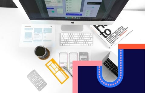
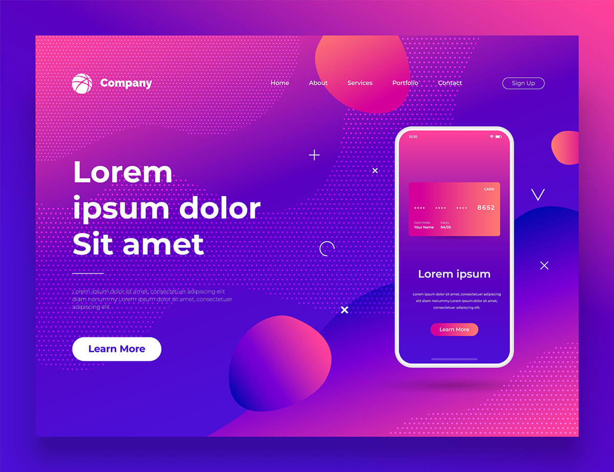
1) Flair over functionality
Designing a webpage to be both beautiful and intuitive can be a difficult thing to master.
Some UX designers focus too much on creating a visually stunning page and neglect to make it functional for the user.
To help avoid this common pitfall, think logically about how your users would navigate your own site.
Are they able to find what they want easily, without having to jump through multiple pages?
All the visual panache in the world will still see users clicking away from your site if it can’t meet their needs, hassle-free.
Take a look at User Guiding’s 9 examples of good UX designs.

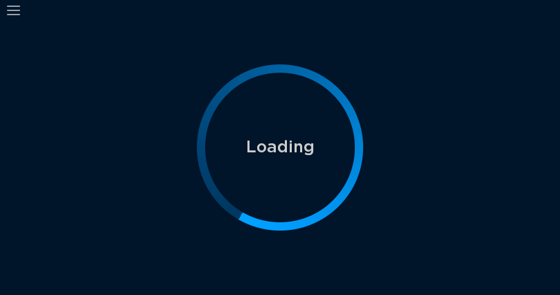
2) Loading…
Gotta go fast!
Sonic The Hedgehog (throwback alert) understands this concept at his core. And you should too.
It’s no great secret that consumers are growing more accustomed to getting what they desire, quicker.
New technologies emerge daily, speeding up our everyday processes.
Everything from food shopping to ordering a new car can be done in a few clicks.
Your website must reflect this urgency with fast loading times so you don’t lose impatient browsers.
Neil Patel reports that consumer expectation is now just 2 seconds to load a page!
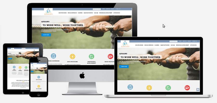
3) Unresponsive design
Responsive design is a term thrown around the industry like Monday morning sighs.
It relates to how your site appears and performs on different devices.
Your site will look and operate one way on a desktop but on a tablet or mobile device, it can work completely differently.
The result of which can be lower conversions, poorer customer experiences and negative publicity.
As a UX designer, you’ll need to optimise web pages for consistency across all devices.
Not only will this make your site look more appealing; it will maximise conversion opportunities and impressions.
Here are 8 reasons an unresponsive site kills online leads.
4) Chaotic and confusing locations
When you want to buy a new television, you’ll have an idea where to go.
When you jump on a retailers site, you’ll likely bet met with the following options:
Shop>Technology>Televisions
Something like that, right?
In UX design, it’s the exact same principle being shared.
Make it easy for users to find whatever it is they came for.
If your site contains lots of information such as products, services, an about us page, contact info, a blog, testimonials and similar: you’ll need to categorise this content to make life easier.
It’s important to navigate users from point A to point B, in as few clicks as possible.
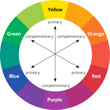
5) Colours, contrast and fonts
Look, we love big, bold and bright colours as much as the next person but when it comes to design - it can hurt more than it helps.
Standing out is great and in many senses actually encouraged for eliciting buyer responses.
But make sure to keep your fonts legible and use colour palettes that complement each other.
Poor contrasts frustrate users with difficult to read text, sending users to competitor sites.
Learn more about contrast and font choices here.
6) Designing first, adding content second
This one can be tricky because should it happen, it’s probably out of your control.
UX designers may be tasked with mocking up a site in a pinch or even well in advance but may not have a copywriter on-hand at the same time.
In the creative world, this is just one of those things that happen.
The issue with it is, when you design a site or a page without the supporting content, the final product will undoubtedly vary after the content has been uploaded.
Typically, Lorem Ipsum acts as a placeholder for where the text will eventually go.
This is all well and good for giving UX designers a rough idea for space and imagery but oftentimes the page will need adjusting to accommodate the content.
Texts may not fit, be it too much or too little, ultimately though, they’ll likely need edits.
If possible, get as much of the content as you can before you start designing.
7) Unclear CTA’s
You’ve done it. You found a brand online that takes your breath away.
Stunning design, beautiful imagery, fantastic products, and messaging that speaks to your soul!
So you try and take your relationship to the next level, perhaps through a purchase and… oh.
You have no idea where to go next.
This romantic anticlimax is the work of a shoddy CTA. Or call-to-action.
CTA’s are crucial in prompting a response from the user.
Whether it’s “finding out more” about a product or clicking “buy now”, it has to be prominent and abundantly clear what you’re asking of the user.
Hubspot gathered 40 examples of click-worthy CTA’s, check them out here.
8) Forms that feel like tests
Nobody, and we mean absolutely nobody; enjoys filling out forms.
Okay, maybe accountants but for the rest of us, form filling is laborious and a major buzzkill.
When you’re designing something like a sign-up form that users fill out. Keep it simple and avoid mandatory fields where possible.
It takes time to build trust with new brands so try to be conscious of this and only ask for information that is a must-have.
Quizzes and survey style questionnaires are more effective further down the buyer journey.
Check out these examples of sign-up forms that nail UX design.
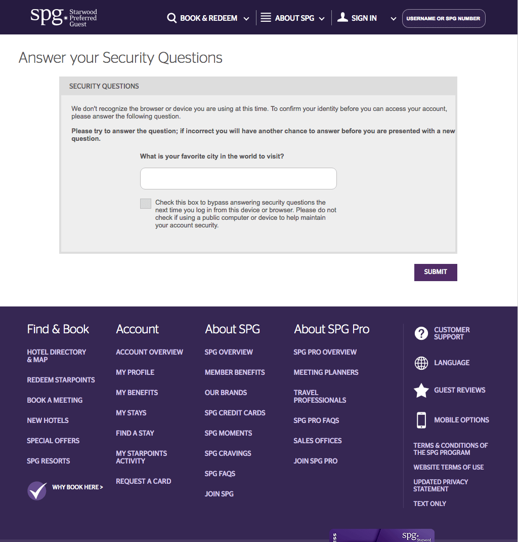
9) Clunky sign-in processes
Be honest. How many times have you accidentally logged out of an account and then after numerous attempts, given up trying to get back in?
It happens to the best of us.
Clunky, bloated sign-in processes deter users.
As a UX designer, you’ll want to make this process a breeze and have multiple options for helping users login to their accounts.
Most internet users will have access to social media so why not use this as another sign-in option?
Here are some great reasons to implement social logins for your sites.
10) Choosing trends over the target audience
A UX designer naturally sits inside the marketing world.
This world is often influenced by popular, societal trends.
It helps us identify customer personas and how best to reach them.
A critical mistake some designers make, however, is that they lean too much into trends.
Letting them influence their design methods, from colours to visual layout, and forgetting the most important factor of all:
Their target audience.
When you design a page, keep in mind who it’s for.
If you’re designing for a niche dental brand, there’s going to prove little benefit it making it visually appealing for TikTok users.
Go forth mighty UX designer!
Now you’re aware of some common mistakes UX designers make, you’ve got a fighting chance in avoiding them at all costs.
For more on UX design, be sure to check out Growth Tribe’s design diploma.
Related articles

Latest articles
AI in Finance: Why You Need It Now
Imagine a world where loans are approved in seconds. Sounds...

ChatGPT Search Unveiled: Should You Make The Switch Now?
Picture this: You’re no longer just “searching” the web—you’re...

Shadow AI Explained: How to Harness Hidden AI Without the Risks
Picture this: your team is under pressure to deliver results—fast....
The 33 best AI tools for commercial teams
The tools are split into 2 categories The best AI tools for your...